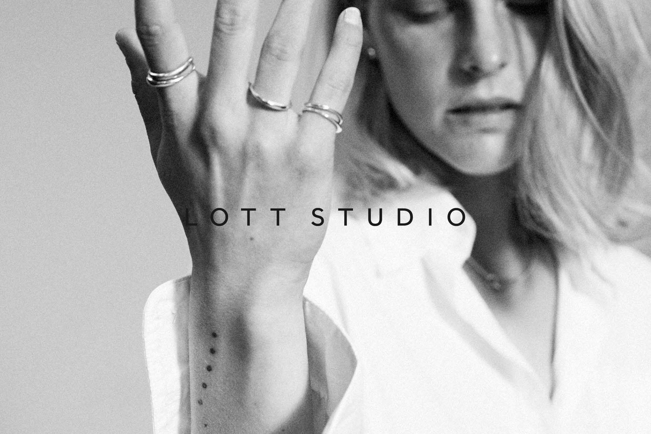
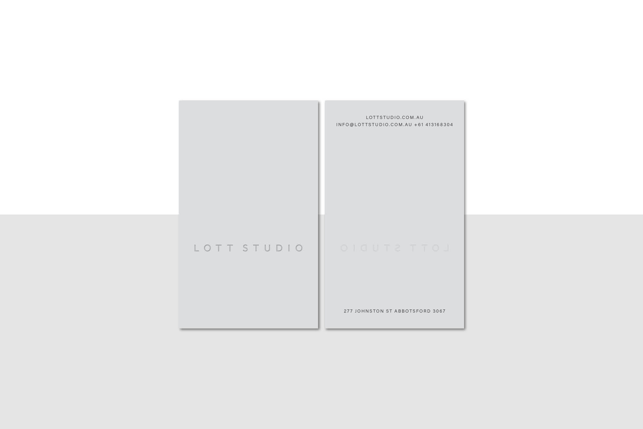
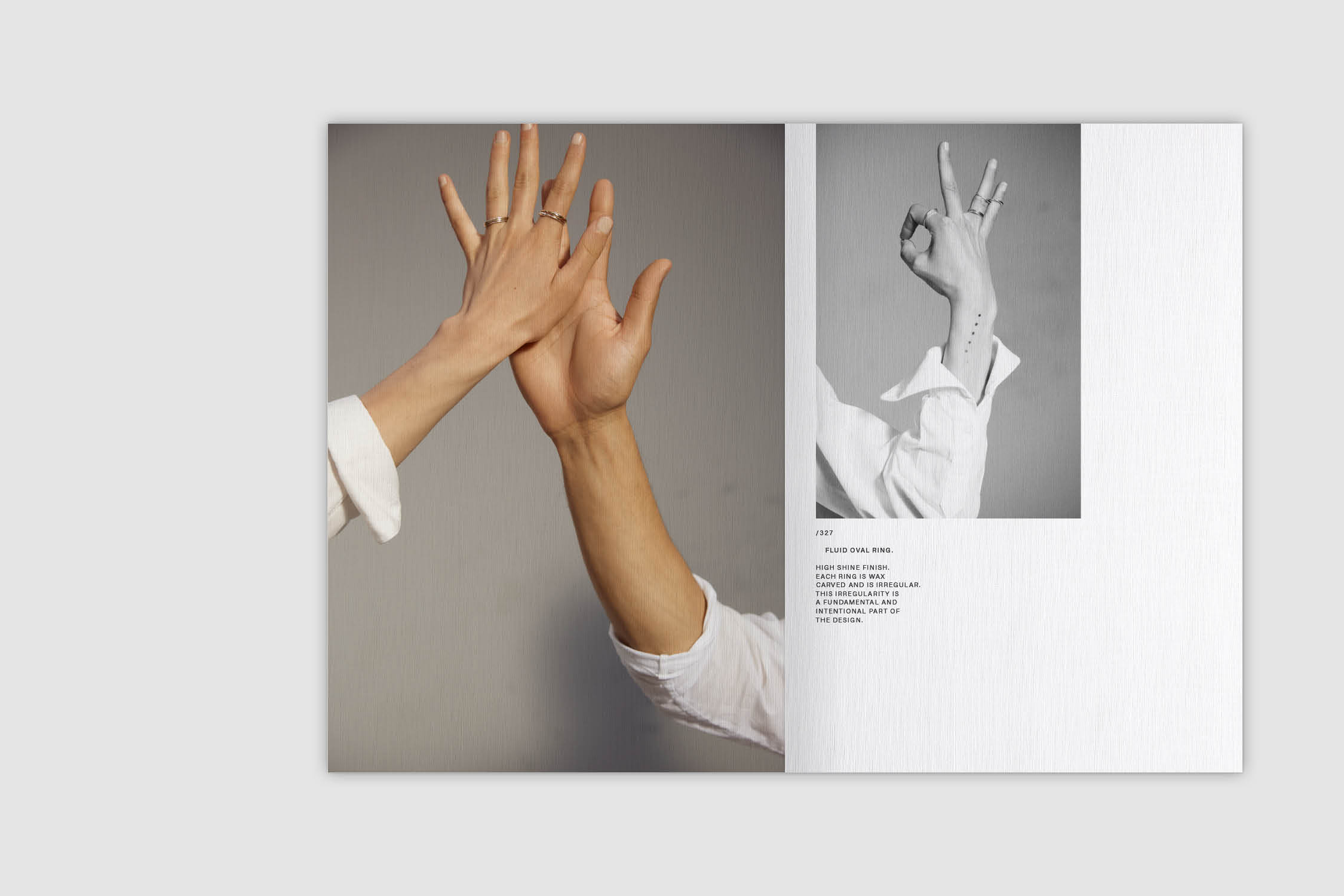
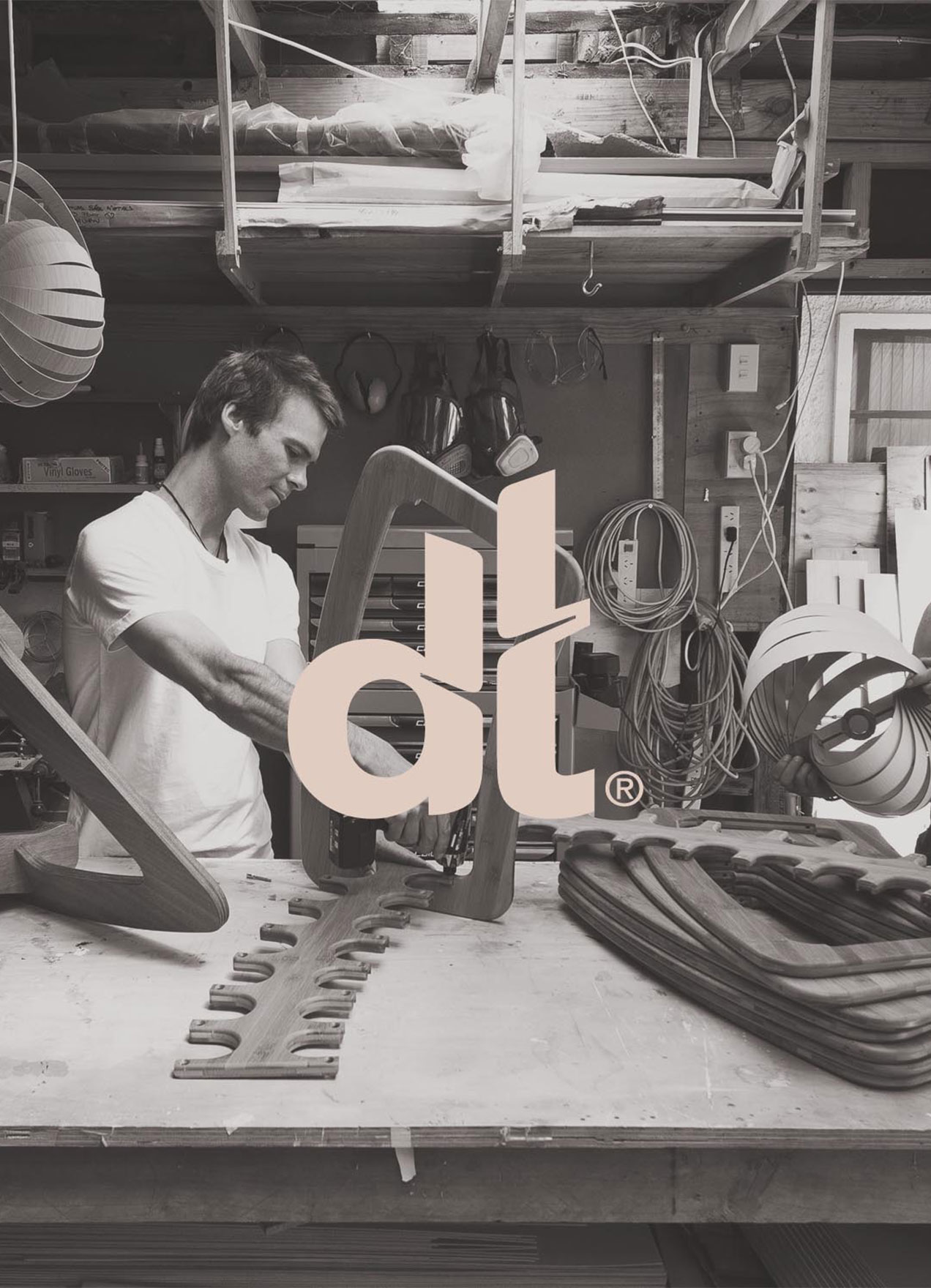
Client. Lott Studio
Services. Visual Identity, Print Design
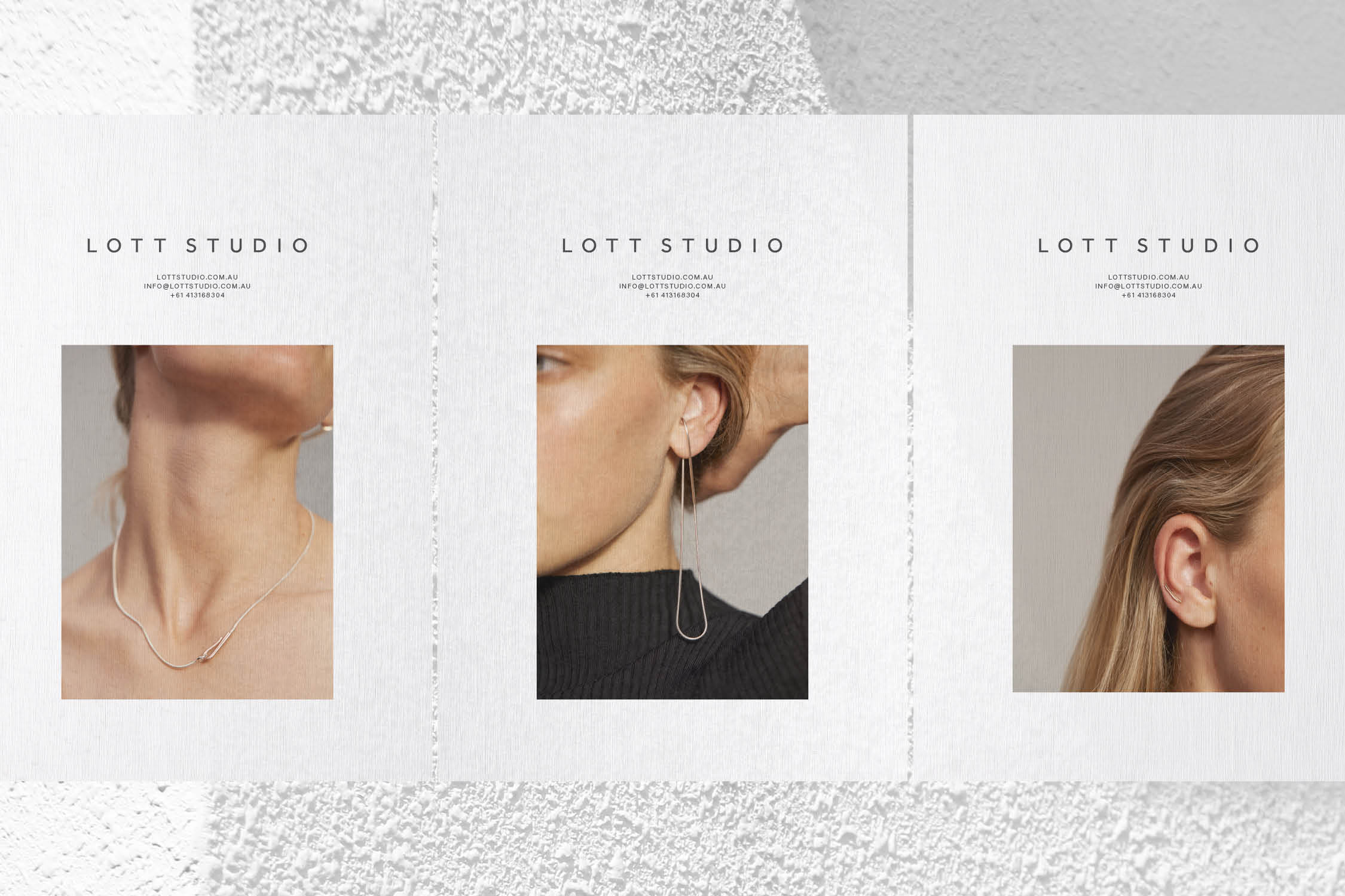
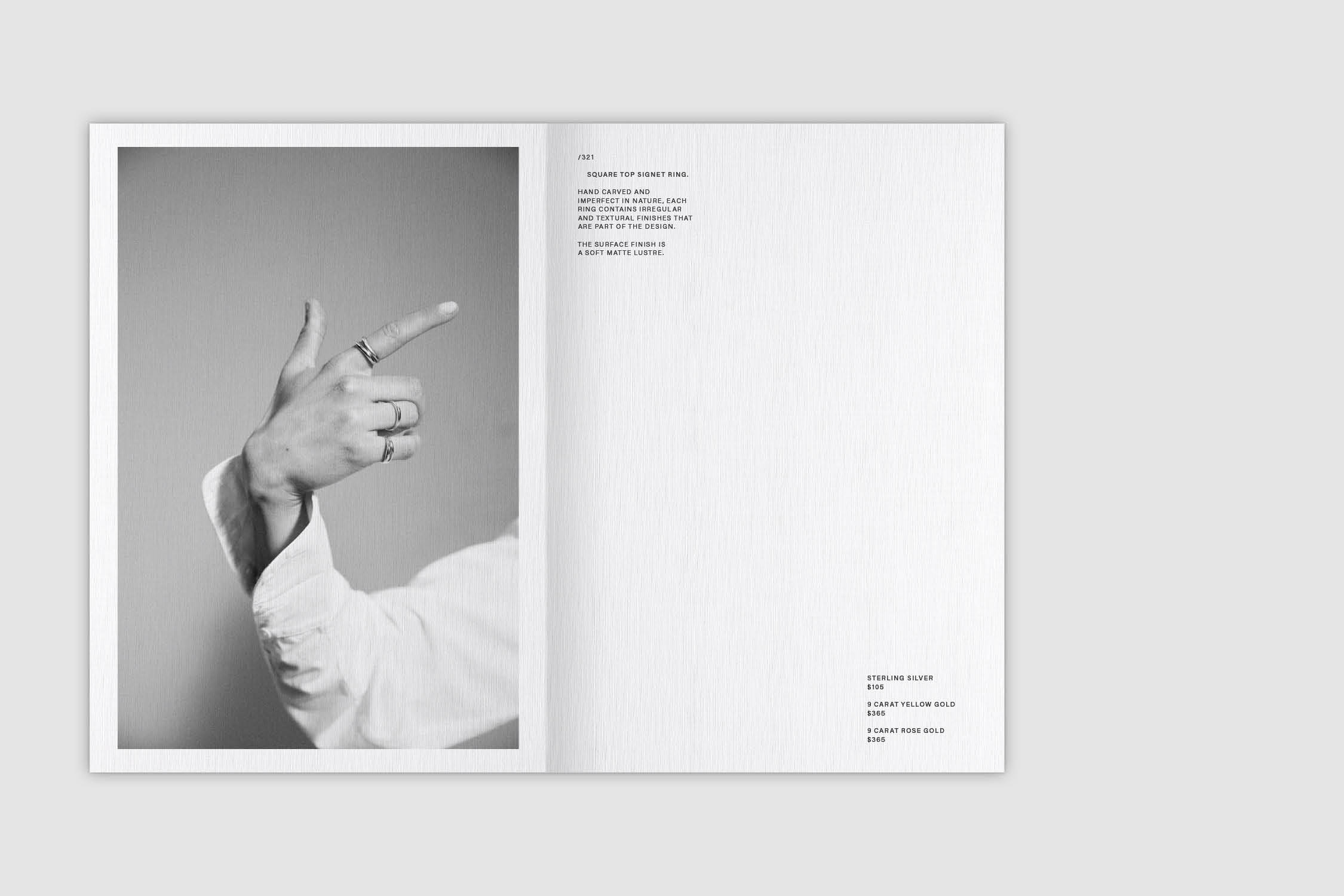
Photography. Tracey Lee Hayes
Models. Alex Griffiths & Jay Bhattacharya
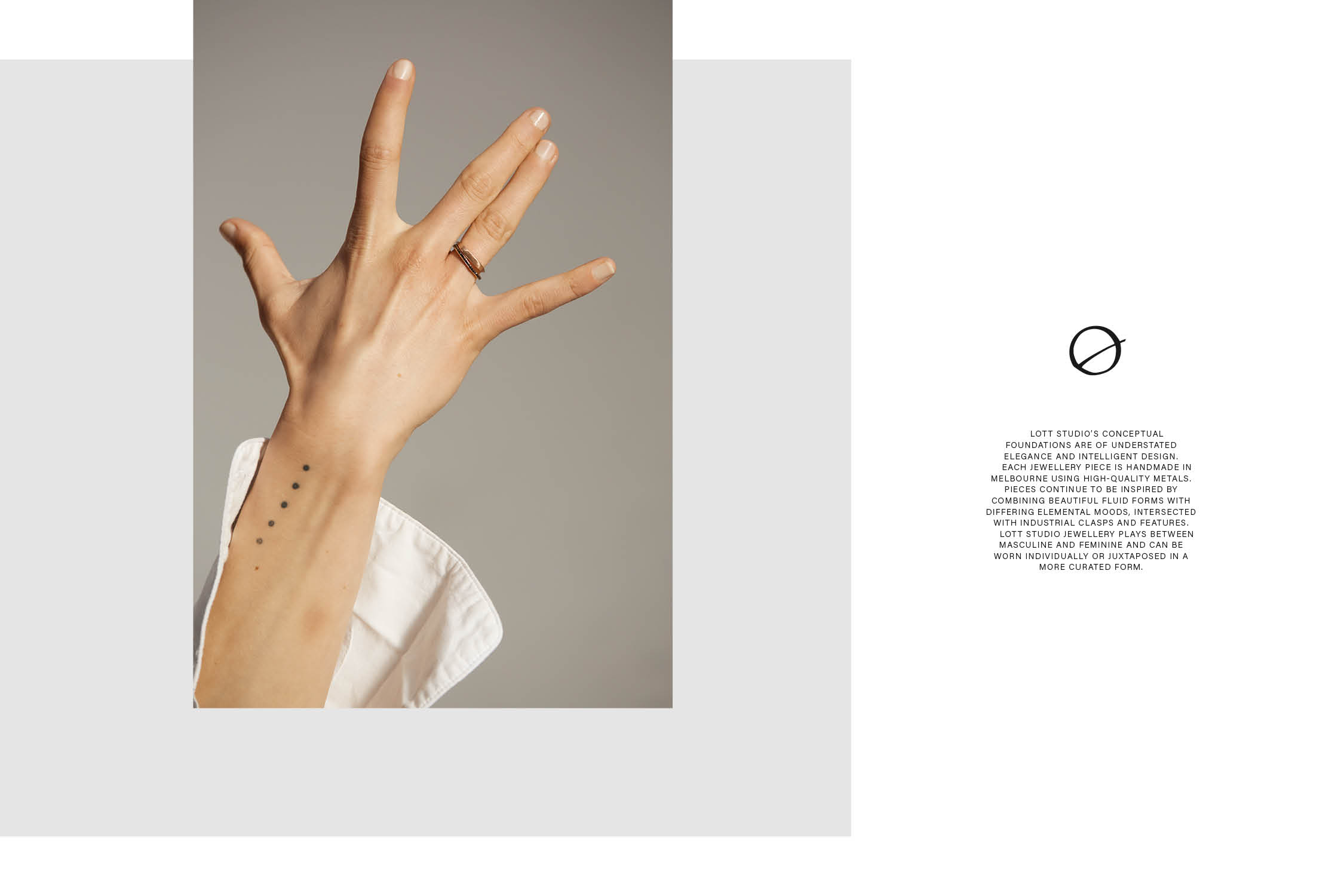
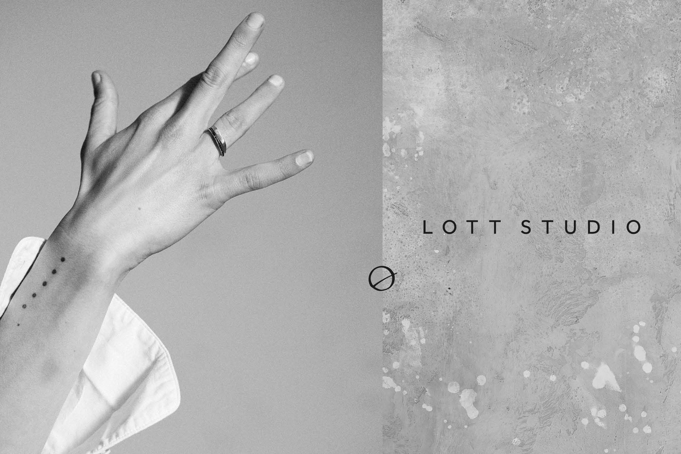
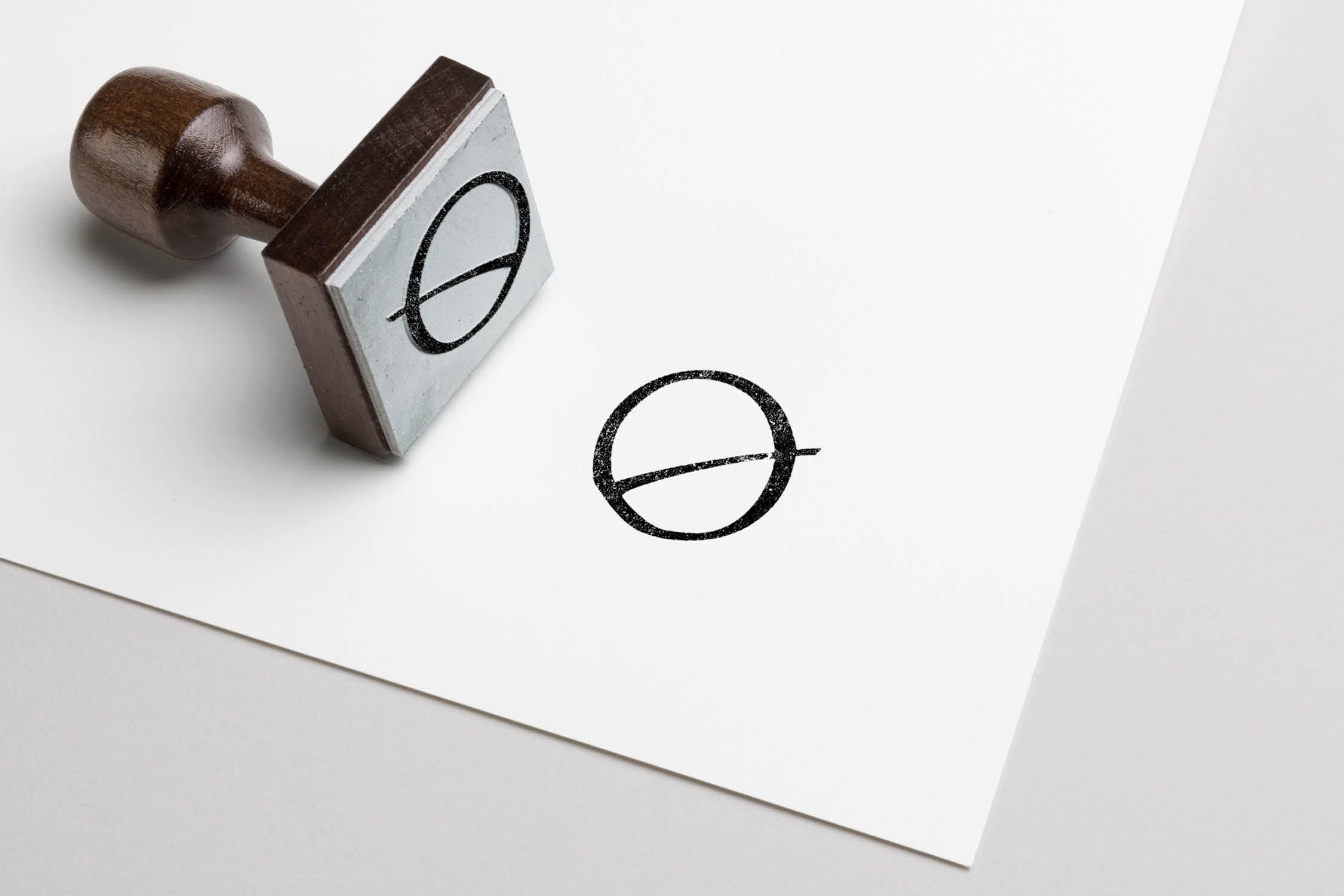
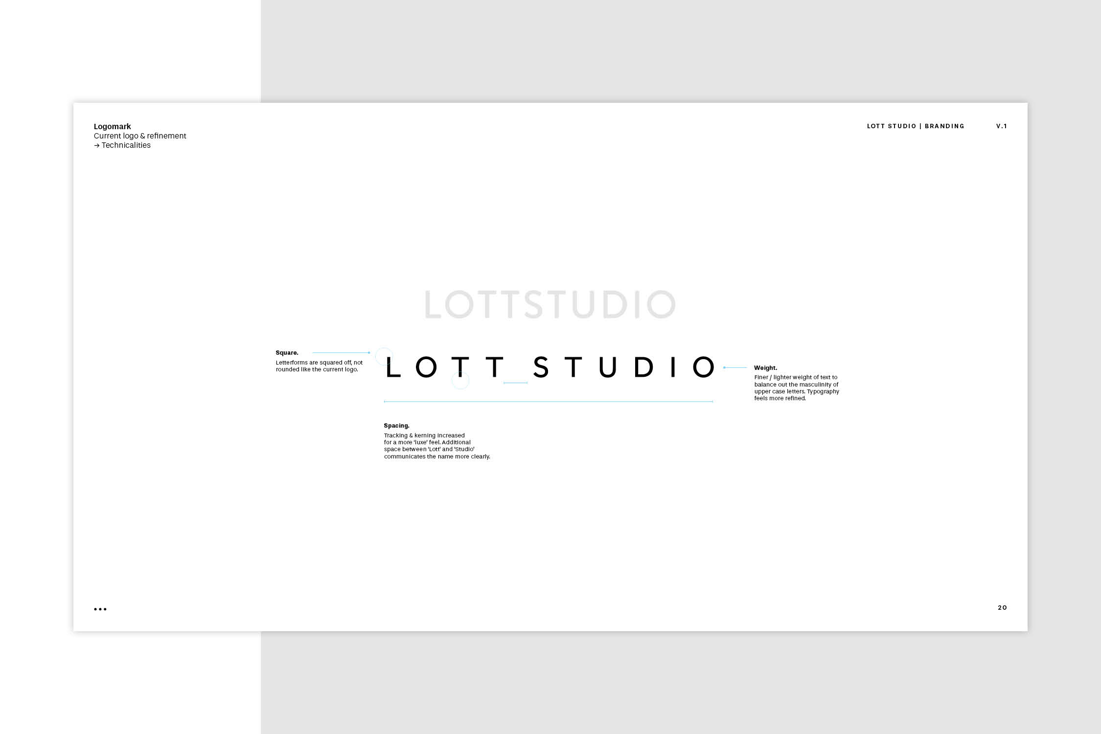
Lott Studio desired a refreshed visual identity that maintained their existing elements but modernised the overall aesthetic. A sleek, bold wordmark and the introduction of a hand drawn monogram sought to reflect their hand-made jewellery processes.
The visual identity balanced a number of tensions such as soft and hard, masculine and feminine, bold and subtle. The aim to highlight imperfections in the monogram’s form was encouraged in execution, for example, the use of rubber stamping by hand.
SELECTED PROJECTS
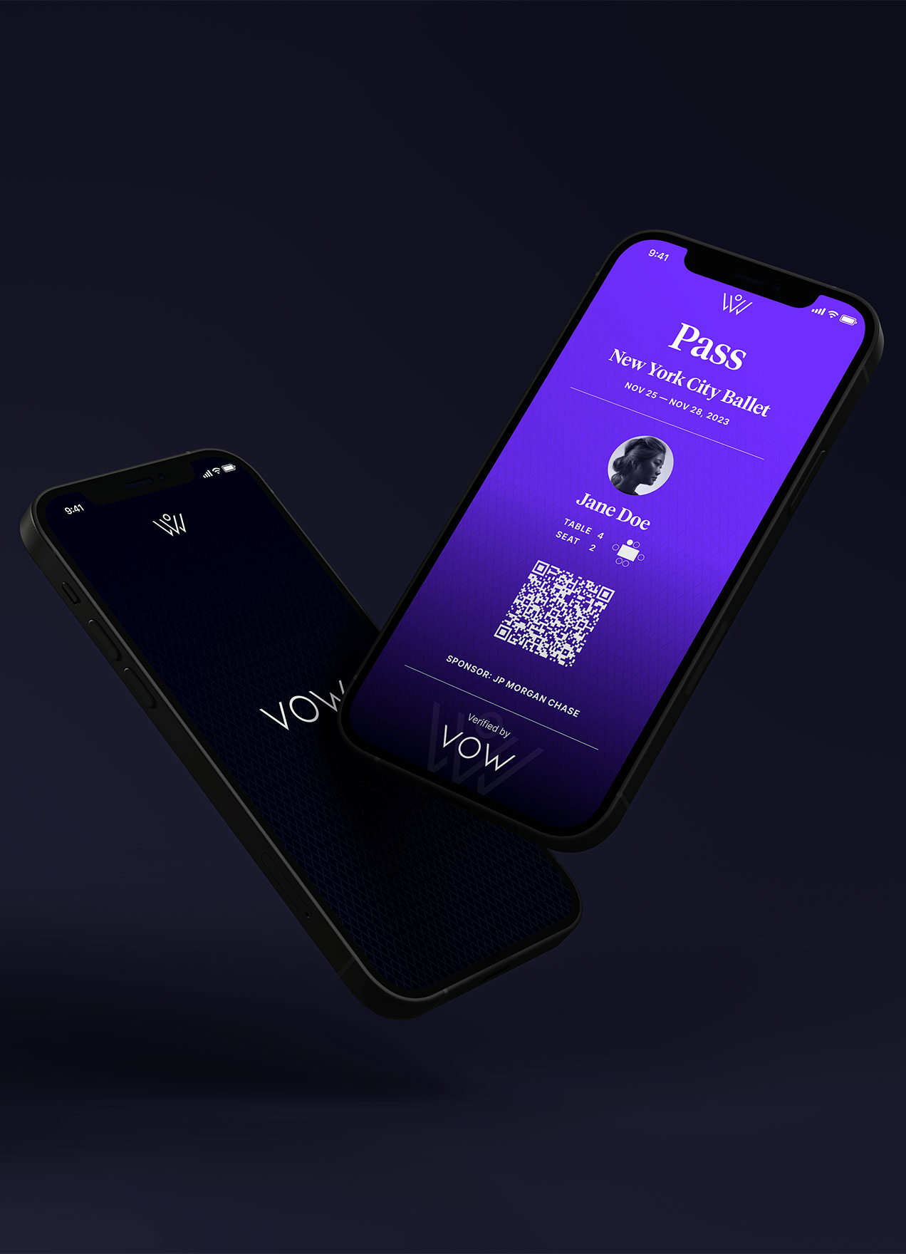
VOWVisual Identity
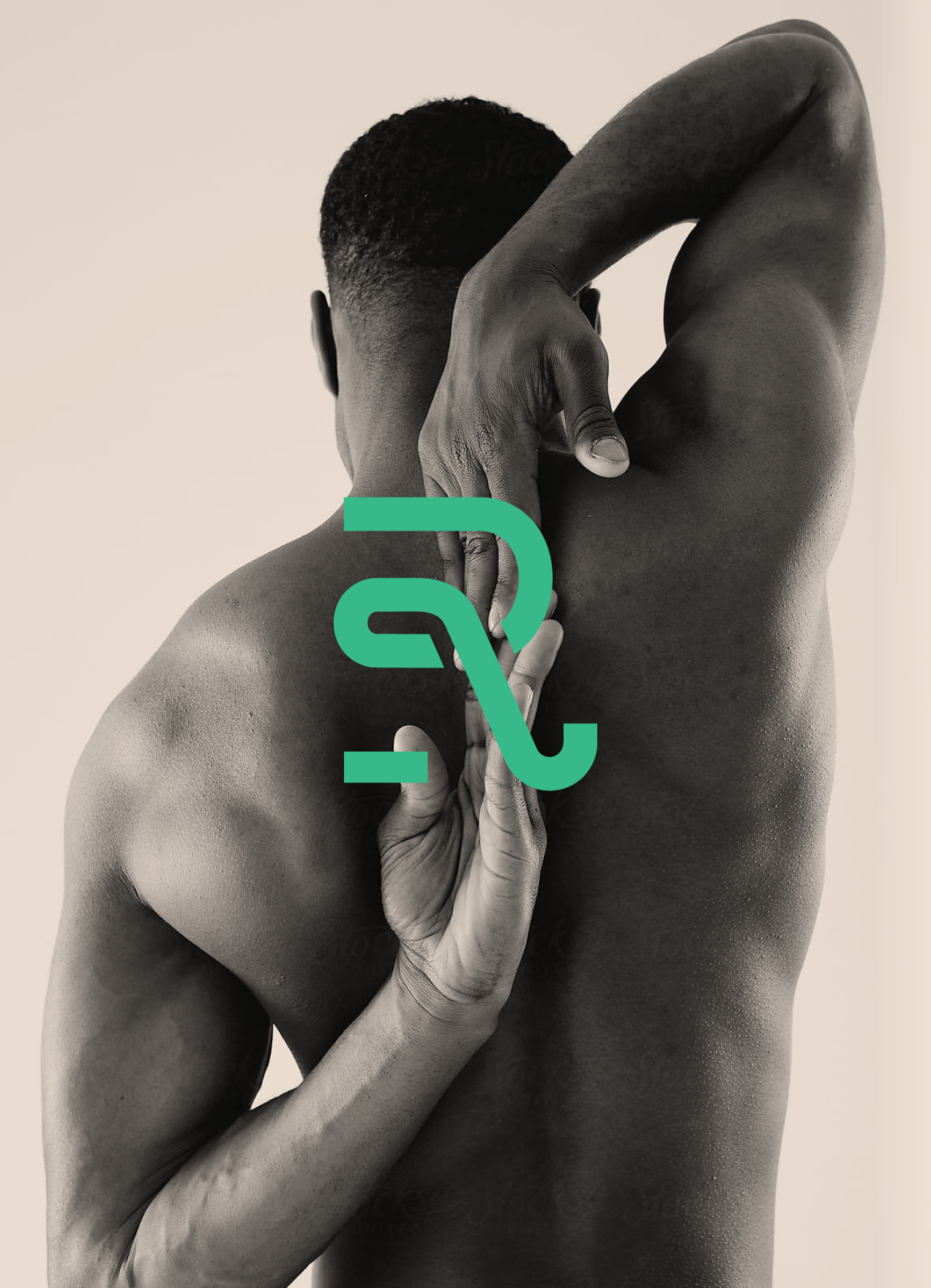
RecoverieVisual Identity
HHHI,Visual Identity, Packaging Design, Print Design
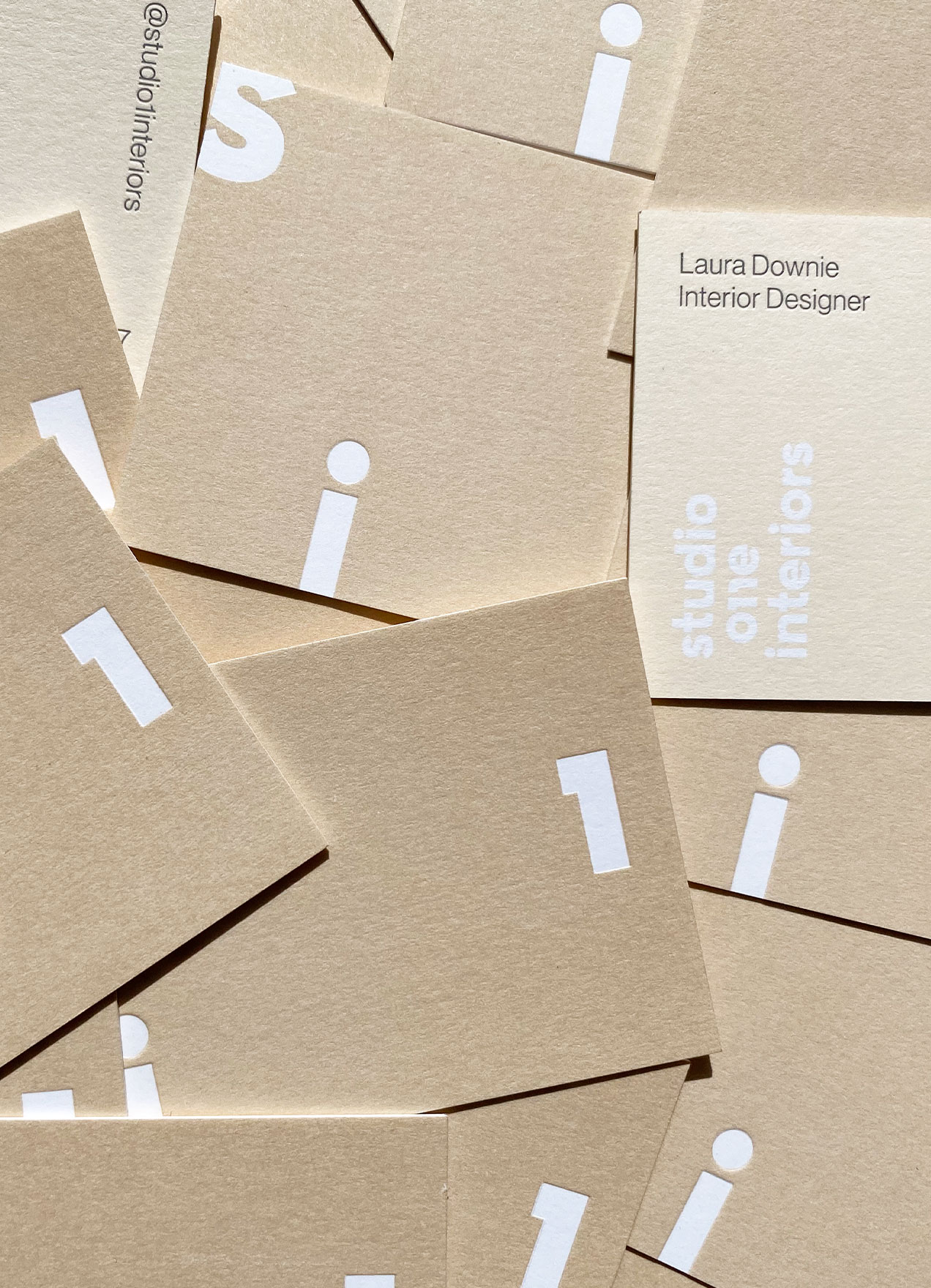
Studio 1 InteriorsVisual Identity, Print Design

Skinfood AgelessVisual Identity, Packaging Design
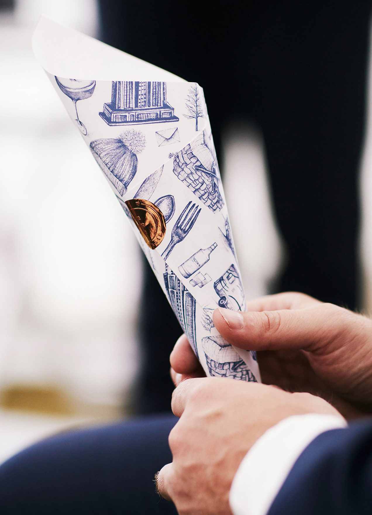
Wedding StationeryCreative Direction, Print Design
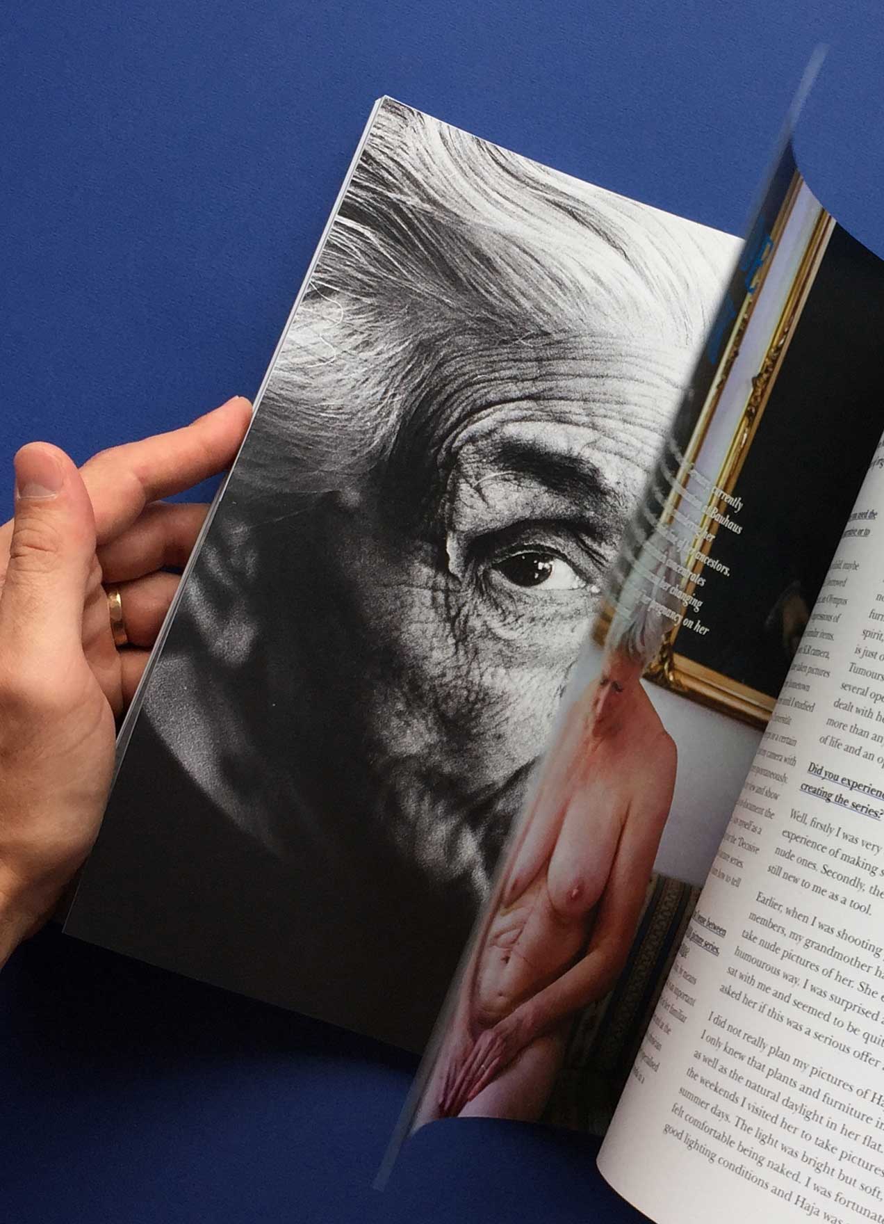
She Shoots FilmVisual Identity, Editorial Design
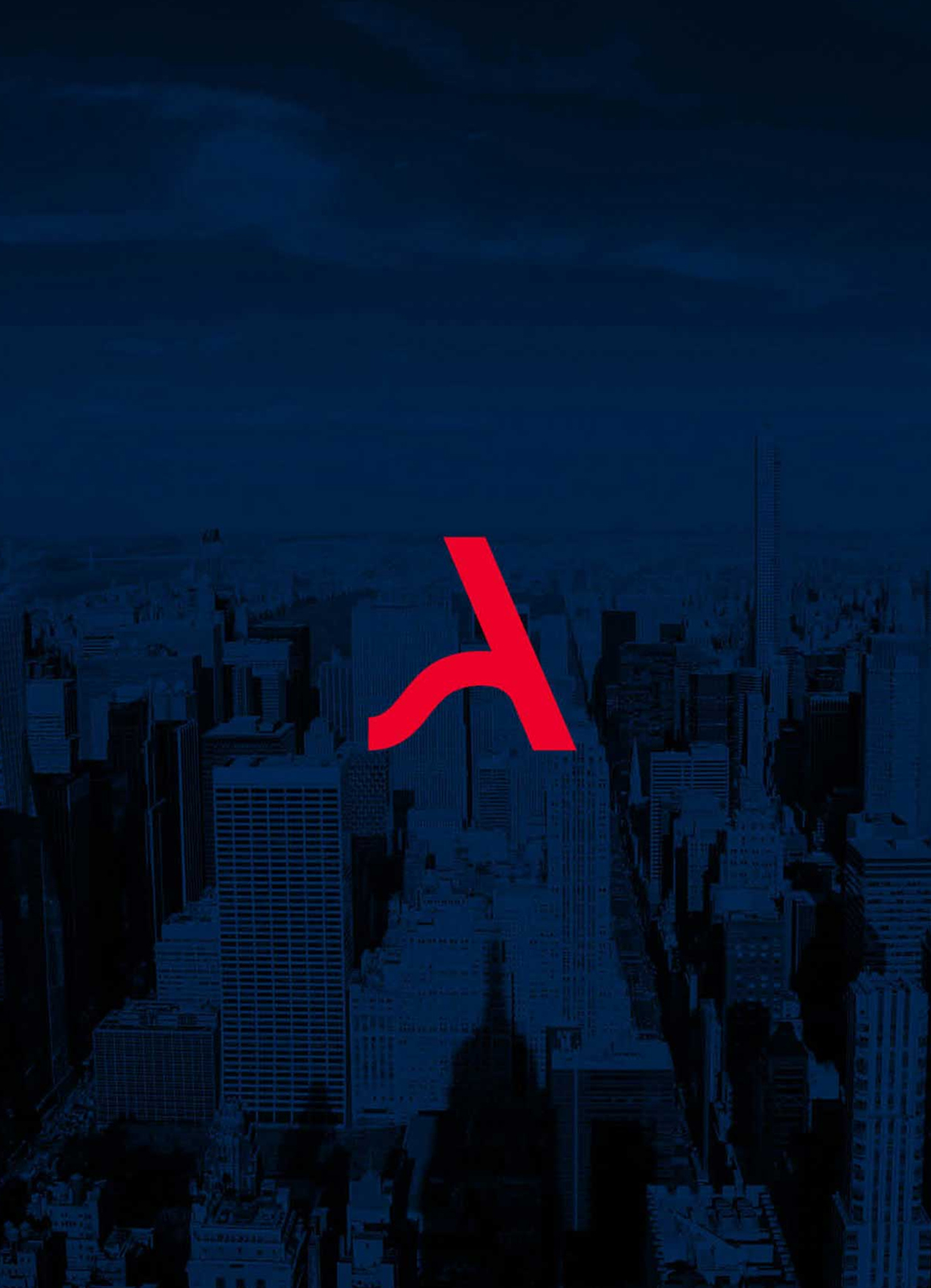
ArgoNaming, Visual Identity, Print Design
DesigntreeNaming, Visual Identity, Print Design
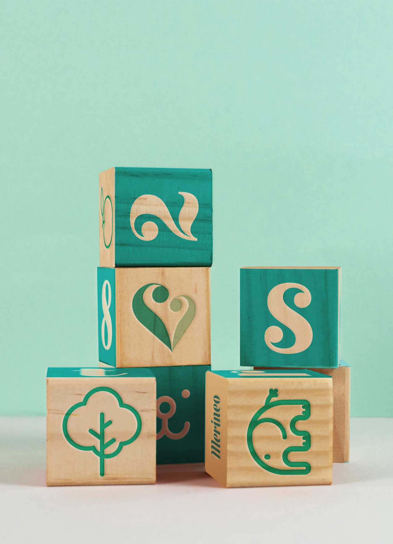
MerineoNaming, Visual Identity, Print Design

Chapter HouseVisual Identity, Print Design
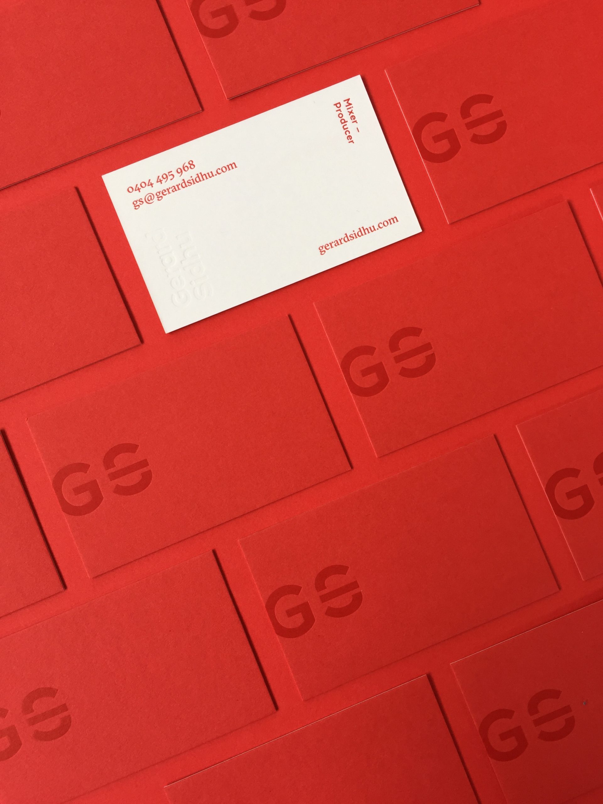
Gerard SidhuVisual Identity, Print Design
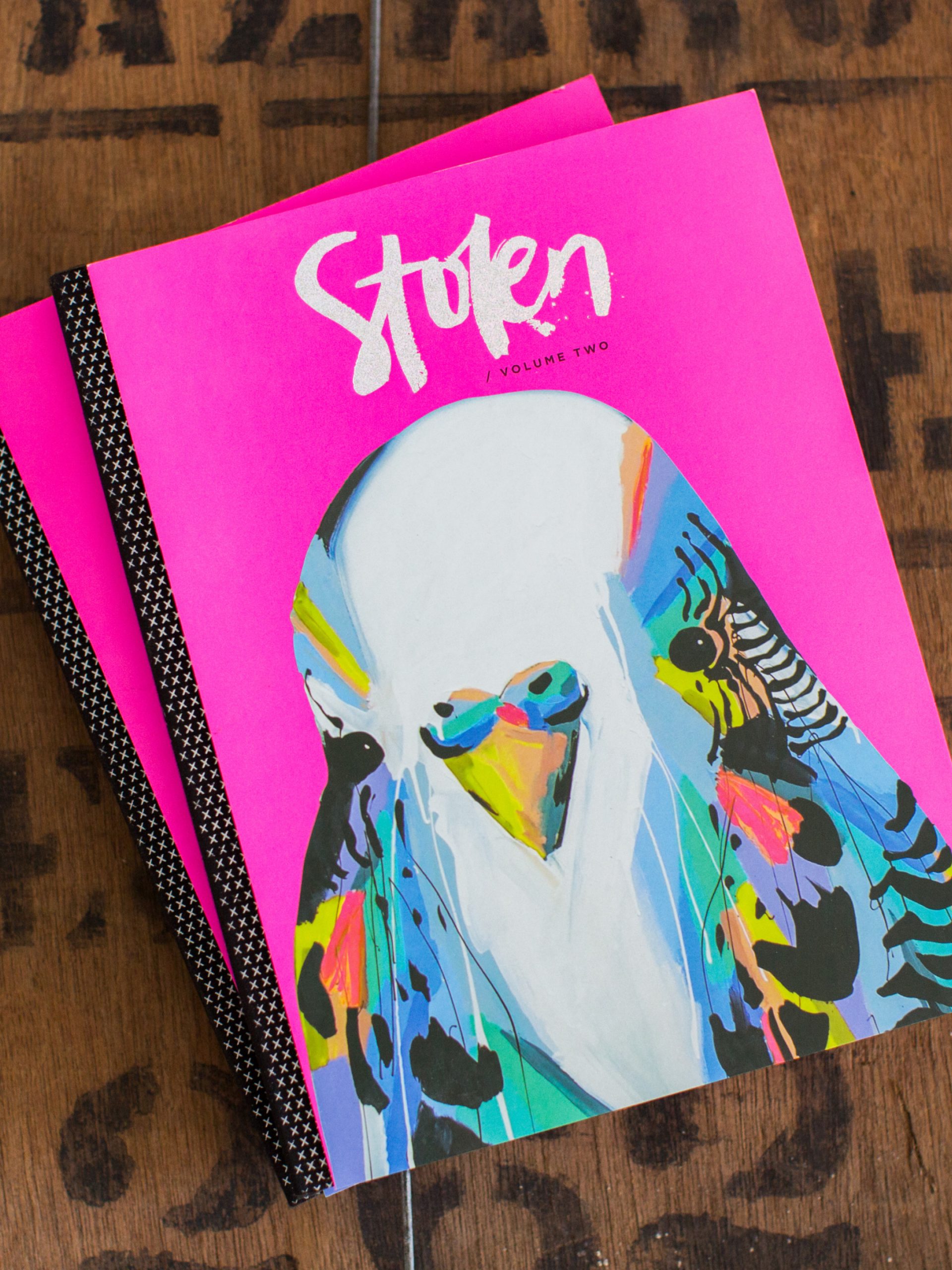
Stolen PublicationsCreative Direction, Visual Identity, Editorial Design